
Why your Etsy icon and logo matter
Your Etsy shop icon is often the smallest, most frequently repeated visual element in your storefront. It may appear beside your shop name, in conversations, on receipts, and across shared links. Your logo may also appear on product images, packaging, thank-you cards, social profiles, and advertisements. Together, these assets help shoppers recognize your business before they read every word.
Good design does not require a complicated illustration or an expensive branding agency. It requires a clear idea, disciplined visual choices, and testing at the size customers actually see. The strongest Etsy identity is distinctive enough to remember, simple enough to understand quickly, and flexible enough to work across different surfaces.
The practical objective is not merely to make a pretty icon. It is to create a dependable visual signal that connects your shop with a particular product category, mood, promise, or customer experience. When shoppers encounter that signal again, recognition can reduce uncertainty and make your store feel more established.
Start with brand strategy
Before choosing fonts or drawing symbols, define what your shop should communicate. A handmade ceramics store, a vintage clothing shop, and a digital invitation business need different visual cues. Design decisions become easier when they serve a specific position rather than personal taste alone.
Write a short brand statement containing three parts: what you sell, who it is for, and how the experience should feel. For example, a shop might sell botanical stationery for thoughtful gift buyers and aim to feel calm, refined, and personal. This statement does not need to appear in the final design. It gives every later choice a useful test.

Identify your recognizable qualities
List three to five qualities that genuinely describe your business. Possible qualities include playful, rustic, precise, luxurious, colorful, practical, nostalgic, modern, or nature inspired. Avoid selecting every appealing adjective. If the identity tries to express everything, it will communicate very little.
Next, identify visual territory already associated with your products. A candle shop may consider flames, vessels, botanical forms, or warm color. However, common imagery can become generic. The goal is not to avoid familiar symbols completely, but to interpret them with a distinctive shape, composition, or combination.
Review competing Etsy shops as a customer, not as a designer. Notice repeated colors, type styles, symbols, and photography treatments. This exercise helps you see opportunities. If many similar stores use delicate script and beige backgrounds, a bold sans serif and deep green may provide clearer separation, provided the choice still suits your products.
Choose the right logo structure
A logo is not one fixed format. You can use a wordmark, a symbol, a combination mark, or an abbreviated monogram. Each structure solves a different recognition problem.
A wordmark uses the shop name as the main visual feature. It works well when the name is short, memorable, and easy to read. A wordmark can build recognition by repeatedly presenting the same lettering, but it may become difficult to use in small square spaces.

A symbol communicates through an image rather than the full name. It is useful when the symbol has a clear relationship to your products or brand idea. Symbols can be memorable, but they usually require repeated exposure before shoppers connect them with the shop.
A combination mark pairs an icon with text. This is often the most flexible starting point for a small Etsy business. You can display the complete lockup when space allows, then use the icon alone for a profile image, sticker, or social avatar. Keep the relationship between both elements consistent.
A monogram condenses initials into a compact mark. It can suit a shop with a longer name, though initials alone may be difficult for new customers to interpret. If you use one, make its letter structure obvious and avoid decorative overlaps that harm legibility.
Match structure to application
Create a primary logo for larger placements and a simplified icon for small placements. Do not force a detailed illustration, slogan, and full shop name into a tiny square. At reduced size, small gaps disappear, thin lines weaken, and letterforms merge.
A useful system may include a full logo, a horizontal version, an icon, and a one-color version. These are not unrelated designs. They should share the same core shape, typography, and proportions. Consistency across variations strengthens recognition because customers repeatedly encounter familiar features.
Design an icon that survives small sizes
The Etsy shop icon is commonly presented as a compact square, so begin with that constraint. Work on a square canvas and test your design at the approximate size customers will see. A mark that looks impressive when enlarged can become an indistinct patch when reduced.
Use one dominant idea. A simple leaf, letter, object, or geometric form is usually more effective than a scene containing several objects. Remove details that do not improve recognition. Ask whether the silhouette remains understandable when the icon is viewed quickly or from a distance.
Strong contrast helps the icon remain visible. Contrast can come from light and dark values, complementary hues, or a clear figure against an uncluttered background. Do not rely on color alone, because customers may view images on different screens or under varying conditions. The shape and value structure should carry much of the identification.
Leave breathing room around the central mark. Artwork placed against the edges may appear cramped or become cropped by interfaces. A consistent internal margin creates a more intentional appearance and protects important details. Test the icon with both a plain square background and the surrounding page colors you expect customers to encounter.
Simplify with a reduction test
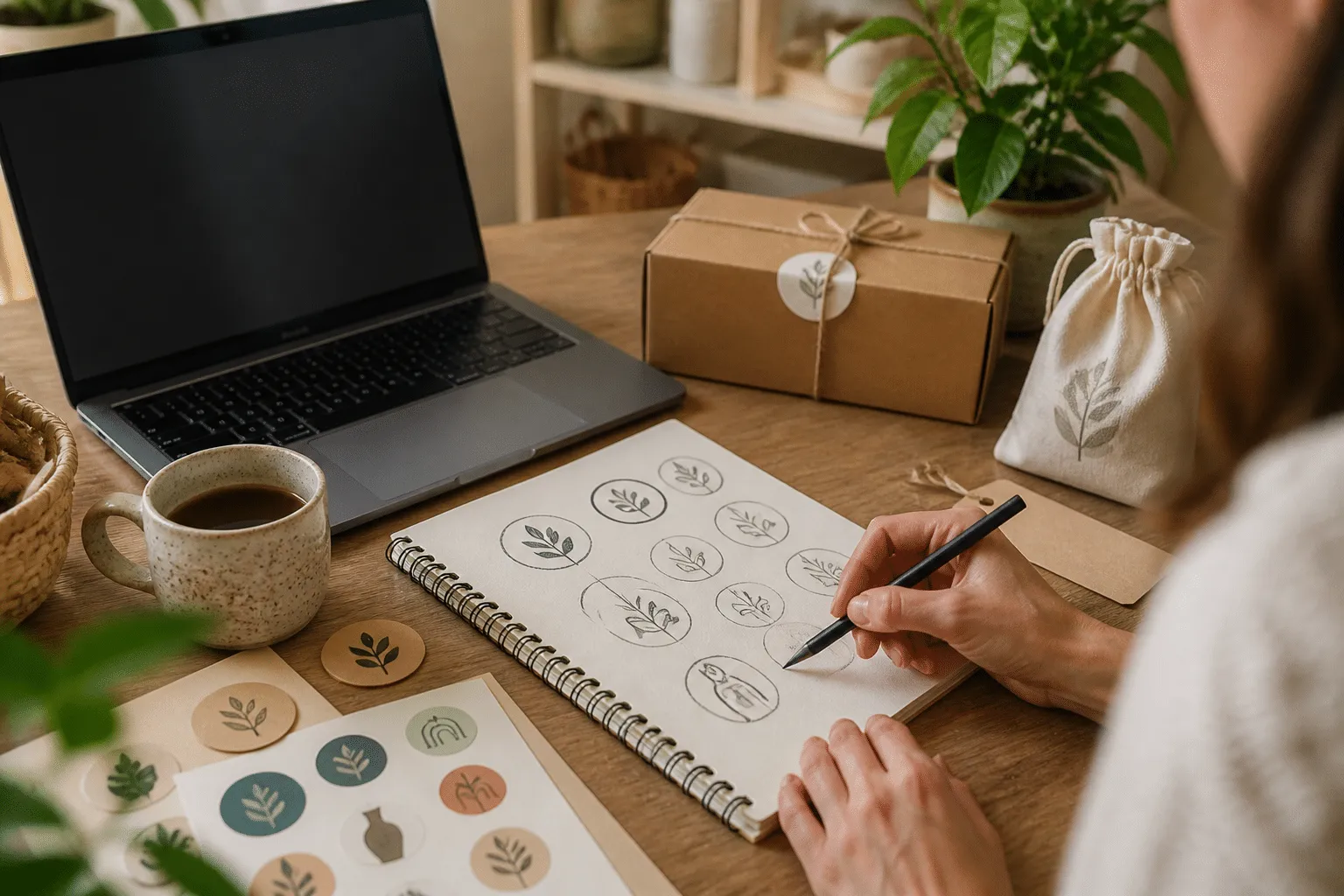
Zoom out until the design is small, then cover the shop name if one is present. Can you still distinguish the icon from a generic blob? If not, remove interior lines, reduce the number of colors, enlarge the essential shape, or strengthen contrast.
An observable checkpoint is whether a viewer can describe the dominant form after a brief glance. You do not need a formal survey; ask several people who have not watched the design develop. If their descriptions differ widely, simplify the mark or clarify its visual hierarchy.
If simplification makes the logo feel too plain, add personality through proportion, spacing, or a carefully chosen color rather than through extra decoration. Distinctive simplicity is more valuable than complexity that disappears at practical sizes.
Select typography for recognition
Typography communicates personality and affects whether shoppers can read your name immediately. Serif fonts can suggest tradition, craft, or editorial quality. Sans serif fonts often feel direct, contemporary, and clean. Handwritten styles can add warmth, but excessive irregularity may reduce legibility.
Choose a typeface for its complete letter behavior, not because one sample word looks attractive. Examine difficult pairs, lowercase forms, numbers, punctuation, and the letters in your actual shop name. Some display fonts look appealing in a preview but become unclear when compressed into a small logo.
Limit the identity to one or two type families. If the wordmark uses a decorative face, pair it with a restrained supporting font rather than another expressive style. Establish a clear hierarchy: the shop name should dominate, while a descriptor or tagline remains secondary.
Adjust spacing deliberately. Kerning controls space between particular letter pairs; tracking changes overall letter spacing. A little adjustment can make a wordmark feel polished, while excessive spacing can disconnect the name. Check the design in uppercase and lowercase if both versions are candidates.
Do not place a tagline in the primary icon unless customers can read it at small size. Taglines are useful in banners, packaging, or larger promotional graphics, but they often become visual noise in a profile image. Recognition depends on a consistent core, not on displaying every message everywhere.
Build a purposeful color palette
Color can create an immediate emotional association, yet attractive colors do not automatically create a useful identity. Select a primary color, a supporting color, a background neutral, and a dark or light contrast color. Define where each will be used so the brand does not change unpredictably from listing to listing.

Consider the products and audience. Earth tones may support natural materials, while saturated colors may suit playful products. A dark neutral can make bright accents more controlled. These are recommendations, not rules; the important question is whether the palette reinforces the shop’s actual character.
Check contrast between text and background. Small lettering needs especially careful treatment. Light text on a pale background can disappear, and colored text may lose clarity when displayed on different screens. Test the palette in grayscale to reveal whether the design depends too heavily on hue differences.
Avoid using too many accent colors merely to appear creative. A limited palette is easier to repeat on packaging, listing graphics, social posts, and printed materials. Repetition creates familiarity, while uncontrolled variety can make a shop look like several unrelated businesses.
Account for reproduction
A color that looks accurate on one monitor may print differently on paper, labels, fabric, or packaging tape. Keep a version designed for one-color reproduction. This allows the mark to remain useful when printing options are limited or when a background makes the full-color version unsuitable.
If you sell digital products, also test how colors look inside thumbnails. A vivid palette may attract attention, but a busy thumbnail can compete with the product preview. Your shop identity should support the item rather than overpower it.
Create a repeatable design system
Recognition grows through consistent repetition. Document your basic rules in a small brand guide. Include the logo files, approved colors, typefaces, minimum clear space, and examples of incorrect use. The guide can be a simple document; its value comes from making decisions repeatable.
Specify how much empty space should surround the logo. Explain whether the icon may appear on photography, which background colors are permitted, and when to use the one-color version. Record the exact color values used by your design software, while remembering that reproduction may vary.
Name files clearly. Keep editable source files separate from exported files, and retain transparent-background versions when appropriate. Export practical formats for your workflow, such as a high-quality raster file for online use and a scalable file when your design software supports it. Check Etsy’s current image requirements before uploading, because platform specifications can change.
Do not repeatedly redesign the identity because of small fluctuations in sales or because a trend has changed. A design needs time and consistent exposure to become recognizable. Consider a refresh when the mark is genuinely difficult to read, no longer fits the product range, or cannot adapt to important applications. Update gradually by preserving a recognizable core.

Protect clarity in product photography
Your logo should not compete with the products. On listing images, use it sparingly and keep the product, scale, texture, and color easy to inspect. A watermark that is too large can reduce trust by making the image feel defensive or crowded. A subtle mark in a consistent position may provide identification without obscuring useful information.
Packaging offers more room for expression. Use the full logo on cards, labels, or inserts, then repeat one recognizable color or icon on smaller details. The customer should see a connected system rather than a collection of unrelated decorations.
Test before publishing
Design judgment improves when testing is specific. Prepare several versions with meaningful differences, such as a wordmark with two typefaces or an icon with two levels of simplification. Avoid presenting dozens of nearly identical options; too many choices make evaluation difficult.
Ask testers practical questions. What do you think this shop sells? Which word or shape did you notice first? Can you read the name quickly? What mood does the design suggest? Does it look trustworthy, handmade, modern, inexpensive, premium, playful, or something else? Their answers reveal communication results, not merely personal preference.
Test at three scales: the shop icon, a medium listing graphic, and a larger printed or digital application. Also test on light and dark backgrounds, in color and grayscale, and against a busy photograph. Record recurring problems and solve those first.
Make one adjustment at a time
If the icon is unclear, change the shape before changing the color. If the name is difficult to read, revise typography before adding decoration. Isolating variables helps you understand whether an adjustment solved the actual problem.
An effective checkpoint is a side-by-side comparison viewed after a short break. The stronger option should remain identifiable without explanation. If you need to tell viewers what they are supposed to notice, the design hierarchy may need revision.
Do not treat every criticism as a command. Feedback is evidence about interpretation, not an automatic design instruction. Compare comments with your brand strategy and audience. A suggestion that improves legibility but makes the identity feel unlike your products may require a compromise rather than complete adoption.
Common mistakes to avoid
One frequent mistake is copying a popular visual trend too closely. Trend awareness can help a shop look current, but imitation weakens distinction and may make the identity age quickly. Borrow principles, not another business’s exact arrangement, symbol, or typography.

Another mistake is relying on initials without giving them a memorable structure. A plain initial inside a circle may look tidy, but it offers little connection to the products or name. Add meaning through a considered silhouette, distinctive spacing, or a visual reference that customers can associate with the shop.
Tiny details also cause trouble. Fine outlines, intricate botanical drawings, miniature slogans, and low-contrast text often vanish in the icon. Keep them for larger formats if they genuinely add value.
Do not use unlicensed fonts, illustrations, stock elements, or copied artwork. Confirm that your chosen assets permit commercial use and that any required attribution is handled correctly. Licensing terms differ, so read the applicable conditions rather than assuming that an item found online is free to use.
Avoid placing the logo over every image by default. Branding should identify the business, not obstruct the customer’s ability to judge the product. If an image needs protection from unauthorized reuse, consider a restrained treatment and prioritize product clarity.
A practical creation workflow
Begin by writing the brand statement and selecting three core qualities. Then collect visual references that represent mood, materials, shapes, and color relationships, not only finished logos. Remove references that are attractive but unrelated to your product or customer.
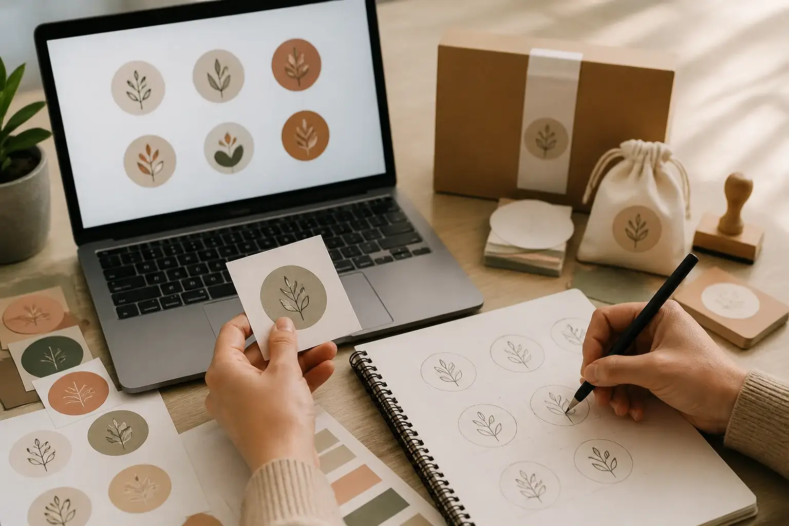
Sketch many rough concepts quickly. At this stage, explore structures rather than polishing details. Select two or three ideas based on clarity, relevance, and distinctiveness. Convert the strongest option into a simple digital version and develop the primary logo and square icon together.
Next, test typography, color, spacing, and reduction. Export previews at realistic sizes and examine them in the context of your Etsy shop rather than on an isolated artboard. Check how the icon relates to your banner, listing thumbnails, product photography, and shop announcement.
Ask for focused feedback, make controlled adjustments, and document the final rules. Upload the icon only after checking cropping, contrast, and legibility. Then use the same approved assets across packaging, social profiles, email, and promotional graphics.
The observable result should be a small set of files you can identify instantly, a logo that remains readable in ordinary applications, and a clear reason for every major visual choice. If a design decision cannot be explained in relation to recognition, audience, product, or usability, reconsider whether it deserves space.
FAQ
Should the Etsy icon and logo be identical?
They can share the same core symbol, but they do not need identical layouts. A square icon may use the symbol alone, while the primary logo combines that symbol with the shop name. Keeping proportions, color, and visual character related makes the versions feel like one identity.
What should appear in a shop icon?
Use one recognizable symbol, a clear monogram, or a very short wordmark. Avoid fitting a long name, slogan, product list, and several illustrations into the square. Prioritize the element customers must recognize first.
Which file format should I use?
Use the formats supported by your design tool and Etsy’s current upload requirements. Keep a high-quality master file, an exported online version, and a transparent-background version when useful. Before uploading, confirm the platform’s latest dimensions and file rules.
Do I need to hire a professional designer?
Not necessarily. A small shop can create an effective identity with careful strategy, simple forms, licensed assets, and repeated testing. Professional help becomes valuable when you need custom illustration, complex packaging, multiple languages, or a system that must serve many channels.
How often should I change the logo?
Change it when it causes a practical problem, such as poor readability, weak relevance, or inconsistent application. Avoid frequent changes made solely from impatience. Recognition depends on repetition, so preserve successful elements during a refresh whenever possible.
Should I include the product type in the logo?
Include it only if it remains readable and supports the brand. A descriptor can clarify an unfamiliar name, but it may limit the shop if your product range expands. Consider placing descriptive language in the banner, shop announcement, or profile instead.
How can I make a logo feel handmade?
Handmade character can come from irregular but controlled lettering, tactile color, simple drawn forms, or material-inspired texture. Use texture carefully, because excessive distressing can reduce legibility. Authenticity comes from a coherent relationship between the mark and the products, not from adding random imperfections.
What if my shop sells many unrelated products?
Choose a broader identity based on your shared customer promise, such as gifting, personalization, sustainability, or playful design. A symbol tied to only one product may create confusion when the range expands. Keep product-specific information in listings and collections.
Can I use AI-generated or stock imagery?
Check ownership, commercial permissions, exclusivity, and marketplace rules before using any asset. A stock element may be legally usable yet too common for strong recognition. A generated image may also require careful review for originality, licensing, and unwanted artifacts. When in doubt, use simple original shapes or obtain qualified legal guidance.
Conclusion
An Etsy icon and logo become valuable when they make your shop easier to recognize, understand, and remember. Start with a focused brand idea, choose a structure that suits real applications, simplify the icon, and make typography and color serve clarity. Build related logo variations instead of forcing one crowded design everywhere.
Test the identity at small sizes, on different backgrounds, and beside actual product images. Listen for recurring confusion, adjust one variable at a time, and document the final system. Avoid copied trends, unlicensed assets, excessive detail, and constant redesign.
The most persuasive visual identity is not necessarily the loudest or most elaborate. It is the one that repeatedly presents a clear, relevant, and dependable signal. When your shop icon and logo work together across Etsy, packaging, and customer communications, every encounter can reinforce the same recognizable promise.